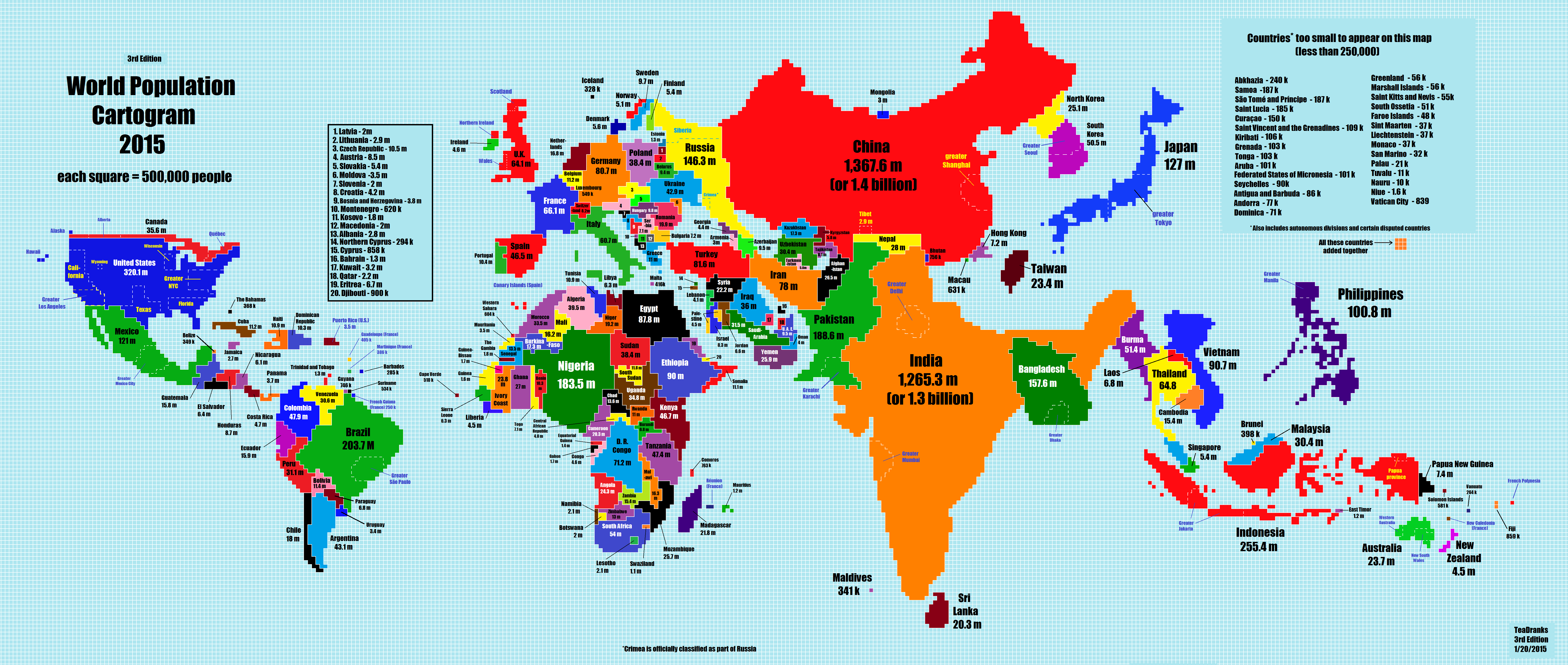
Most of us have pretty bad intuition about the relative populations of the countries of the world. I certainly do, despite my many attempts to improve.
Paul has found this map, which scales the world according to population:

My own approach has been lots of time staring at Wikipedia’s various listings of countries by population.
That’s a start, but it still leaves out the dimension of time. Why are our intuitions about population so inaccurate? Ignorance is part of the reason, but part is just being out of date. Even historical eurocentrism makes a bit more sense, when you consider that, fifty years ago, Europe had about thrice the population of Africa. Africa took the population lead some time this century, and by 2050 will have perhaps thee times the population of Europe.
So it wouldn’t have been
so
irrational if your grandparents gave France more attention than Nigeria. But general knowledge takes a while to catch up — a lot of it is inhaled in school, using books that might easily be a decade out-of-date, and we hold onto it for the future decades of our life.
So take a good look at wikipedia’s List of countries by past and future population. The 1950s figures, to my mind, correlate quite well with the size countries have in our popular imagination. China and India at the top, the US and Russia understood to be huge, then countries like Brazil, Japan and Pakistan, before reaching the larger European states.
The current figures seem far less familiar. Bangladesh is more populous than Russia, Ethiopia has twice the population of Spain, and so on. The estimates for the future get more alien the further the get. I’ve spent a fair while looking at the 2050 figures. While I can understand them in my head, I’m so conditioned to focus on Europe that I can’t come to grips with its demographic insignificance.